


Projects:
Intermec Technologies
- Accelerometer Calibration Application
- Intermec Connection Manager Icon
- Enhanced Mobile Document Imaging (eMDI)
- CS40 Competitive Analysis
- Additional Projects
University of Washington
Accelerometer Calibration Application Interface and Icon Design
Interface Design
The CN70 handheld computers contain an accelerometer that initially needs to be calibrated in the factory and could possibly need to be calibrated in the field. Therefore an application to accomplish this was being developed for this device.
I was asked to assist in developing the user interface for this product. The engineer developing this product had initially put together an interface during the initial programming.
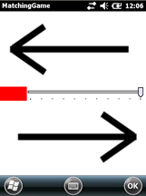
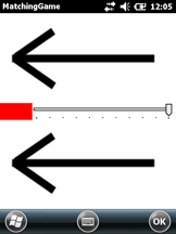
Engineers initial interface
It required the user to position the device in 6 different orientations in which the device needed to be parallel to the floors and walls and to keep it in each position until it had calibrated. We tested this design and found that users had a difficult time understanding how the device needed to be oriented along with the fine tuning of that orientation.
I worked with the Senior UX designer on designing a better user interface for this application. We collaboratively came up with a system similar to an attitude indicator on a plane. In this system, the user matches the green dial to the green tick for each of the axes (x and z) and the name of the screen orientation that is being calibrated is placed as a title located at what would be the top of that device orientation.
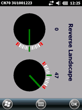
New interface design
During development, the new UI was iteratively tested and the design was found to be more clearly understood by the user. This interface was implemented and currently used for this application.
Icon Development
Then I developed the Accelerometer Calibration Application Icon. Initially they just had a placeholder, with no icon. The new icon needed to fit within the design style of other Intermec application icons.
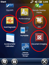
Icon placeholder and Intermec application icons
I began by brainstorming through sketching.
Following the sketching, I evaluated concepts from previous Intermec designers and general accelerometer icons. I created additional concepts from this research, and imported my top concepts into Illustrator.
The concepts were reviewed within my team, and I further developed the results through 3- 4 sheets of iterations.
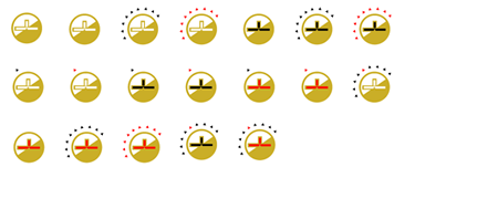
These were narrowed down through additional reviews, and the final design was chosen.
This was then developed into the icon using Photoshop CS5 and Axialis, and delivered to the stakeholder for this application.

copyright © 2013 Linda Brooking. All rights reserved.