


LUTE website design elements
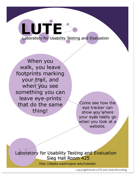
The Laboratory for Usability Testing and Evaluation (LUTE) did not have a logo or an identifying graphic, so as part of the web design I created a logo for LUTE using Illustrator. One of the identifying features of LUTE is the eye tracker. I felt it was important to integrate this feature into the logo. The way that I did this was by replicating an eye tracking map - numbers within varying sized circles. The numbers represents the order in which a viewer looks at objects, and the circle size indicates length of time spent viewing that object.
For Engineering Discovery Days at the University of Washington, LUTE needed a flyer to hand out to students so they could find more information about LUTE on it's website. This event was targeting 4th - 12th grade students. I expanded on the LUTE logo and encorporated that into the flyer to continue the consitancy created on the website, so that it would be easily identifiable. This flyer was also created in Illustrator.
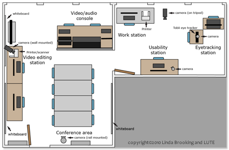
Finally, LUTE did not have a current floorplan which would inform students and researchers about the facilities LUTE had and how the space was arranged. In order to provide this information, I created the floorplan in Illustrator after taking measurements of the furniture and the two rooms.
LUTE logo
LUTE Engineering Days flyer
LUTE floorplan
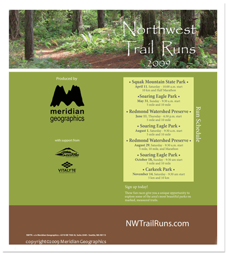
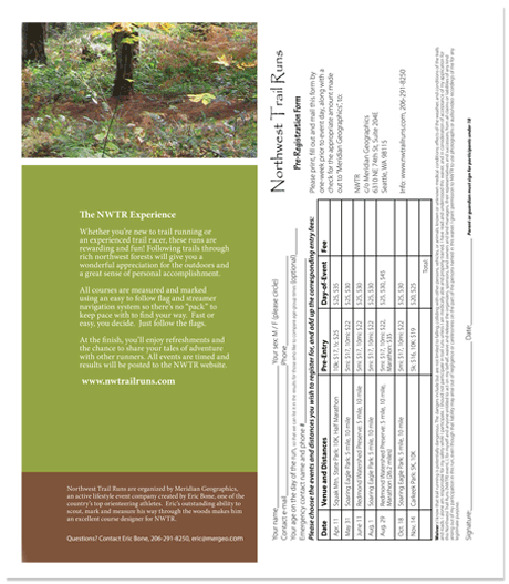
Meridian Geographics: 2009 Northwest Trail Runs
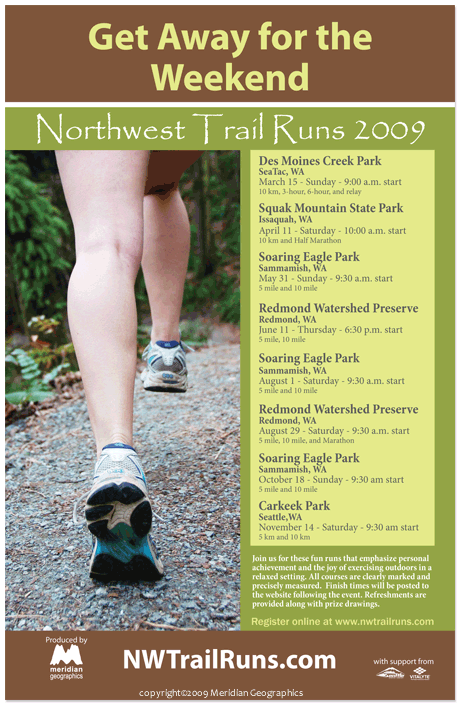
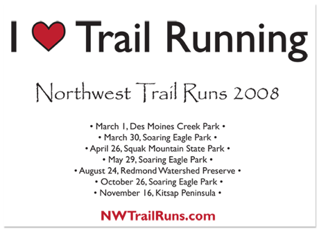
This was the second year that I had worked with Meridian Geographics on the Northwest Trail Runs collateral. For the 2009 collateral, my goal was to create a more unified identity that reflected the established website. The color scheme stayed the same as last years collateral, specifically the registration brochure.
The brochure was similar to the 2008 in that it had the same descriptive content, but the top image was exchanged for one with a higher resolution and the information associated with the races also changed. The layout was expanded slightly so that the registration form was easier to fill out.
Once again the poster color ties into the brochure and uses a picture provided by Meridian Geographics of a trail runner.
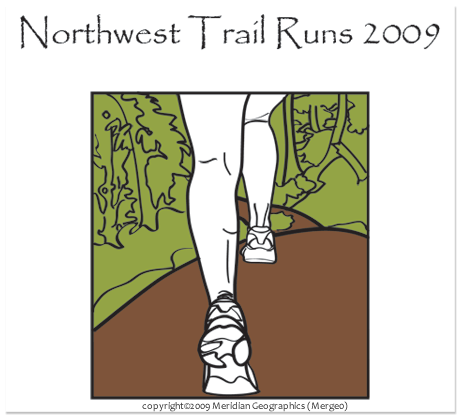
The t-shirt design, which was printed on a light tan technical fabric shirt, was based on the photo used in the poster to create a cohesive theme for the collateral. I stayed with the similar colors for that reason.
Brochure cover
Brochure interior
Poster
T-shirt front
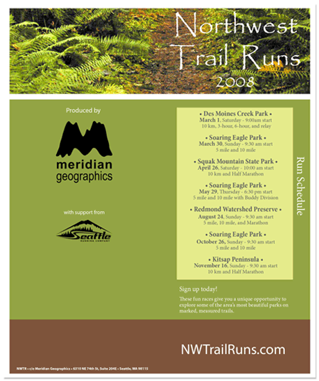
Meridian Geographics: 2008 Northwest Trail Runs
This was the first year that I had worked with Meridian Geographics on their Northwest Trail Runs collateral. It was also the first year that they had anyone working on collateral for the events, so the designs seemed less cohesive as they were needed quickly in order to get them out before the race season started. I worked with their marketing manager to come up with the collateral.
The brochure used the color scheme and image from their website along with font, Papyrus, which had been established for a number of years on their website. The layout was consistant with other race brochures, so the audience would be familiar with the format.
For the poster, the marketing manager came up with the theme of "best dirt of the election year." After sketching a few ideas, I came up with the election ballot poster. I took the format of the washington state ballot, and recreated it in Illustrator using each of the race events as a "candidate". Then I set up and took the photo that consisted of the background and the dirty ballot. I then adjusted it in photoshop and created the poster layout in InDesign.
The t-shirt theme came from the marketing manager. I choose the fonts and the layout for the t-shirt and created the heart in Illustrator.
Brochure cover
Brochure interior
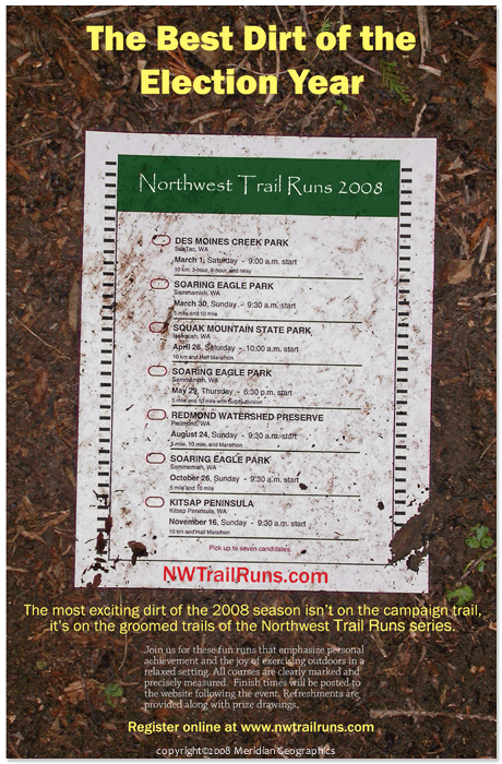
Poster
T-shirt front
Meridian Geographics:Beast Race
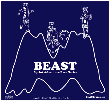
Meridian Geographics hired me to create a t-shirt design for their BEAST Adventure Race series. They already had a logo for the series - an energy bar with the name BEAST on it. I took the Meridian Geographics logo - the mountain letter M and combined that with the BEAST bar. To make it fun and interesting, I depicted some of the activities involved in this race series throughanthropomorphizing the BEAST bar and showed it biking, running, and orienteering with a map over the Meridian Geographic logo. The t-shirt was printed using white ink on a navy blue technical shirt.
T-shirt front

copyright © 2013 Linda Brooking. All rights reserved.